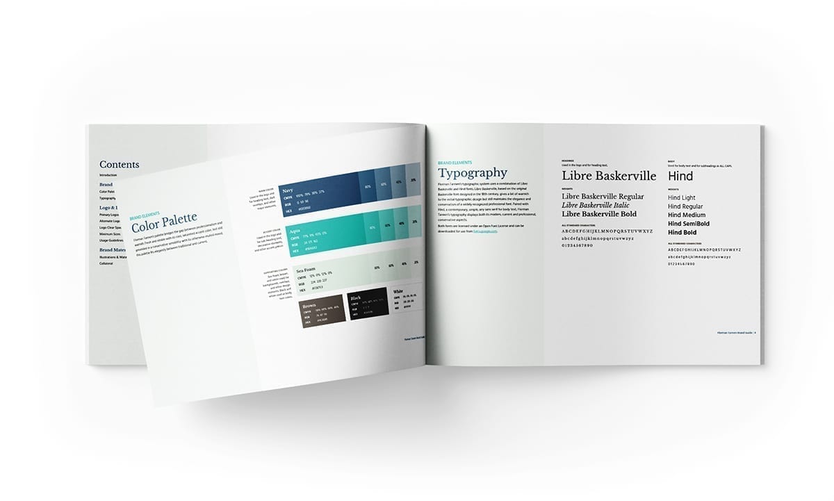
fbpx

Case Study: An Elevated Rebrand for Florman Tannen’s High Quality Services

Challenge

Florman Tannen is a national consulting firm that works with healthcare providers to optimize their payer contracts and relationships. They serve a wide variety of providers, facilities, and vendors within the healthcare industry. Florman Tannen is a widely respected firm; however, its brand and website did not reflect its high level of expertise and professionalism. Florman Tannen approached our Design & Development and Social Media teams at Online Optimism for a complete visual rebrand, new sales collateral, a new website, and a LinkedIn audit.

Florman Tannen's previous logo and website
Florman Tannen’s previous logo and website

Creating Florman Tannen’s New Brand

Florman Tannen needed a new visual brand that would reflect the company’s professional, modern, relationship-based approach, and its status as a leader in the healthcare consulting field. After a few rounds of review, our Design team built a new brand that was professional yet warm, displaying a conservative sensibility moderated by a sense of modern dynamism.

Florman Tannen's new color palette and typography

Color Palette

Florman Tannen’s palette bridges the gap between professionalism and warmth. Fresh and nimble with its cool, saturated accent color, but still grounded in a conservative sensibility with its otherwise muted mood, this palette fits elegantly between traditional and current.

Typography

Florman Tannen’s typographic system uses a combination of Libre Baskerville and Hind fonts. Based on the original Baskerville font designed in the 18th century, Libre Baskerville, gives a bit of warmth to the initial typographic design but still maintains the elegance and conservatism of a widely recognized professional font. Paired with Hind, a contemporary, simple, airy sans serif for body text, Florman Tannen’s typography displays both its modern, current and professional, conservative aspects.

Logos

The primary horizontal logos—one with and one without a tagline—serve as the central brand imagery for Florman Tannen. Alternate versions of the logo, including a stacked version and a visual mark, round out the logo system for multiple use cases.

Florman Tannen's new logos
Early Sketches of Florman Tannen’s new logos
Early sketches of possibilities for Florman Tannen's new logo
Early Digital Versions of Florman Tannen’s Logo Options
Early digital options for Florman Tannen's new logo
Florman Tannen’s new logos
Florman Tannen's new horizontal logo with the tagline
Florman Tannen's new logo mark
Florman Tannen's new stacked logo
Florman Tannen's new horizontal logo
Florman Tannen's illustrations and watermarks, as displayed in their brand guide

Illustrations & Watermarks

Florman Tannen’s brand includes two types of graphic imagery—vector illustrations and watermarks based on the logo design—to support decorative brand elements.

The vector illustrations, which include rings of broken circles centered around a simple compass design, speak to Florman Tannen’s role as a navigator for its clients. They also add a bit of visual interest and fun to the brand.

The watermarks help enhance the brand’s overall extent, adding both texture and reinforcement of Florman Tannen’s logo design to collateral and digital designs for the brand.

Crafting Professional Sales Collateral

Using Florman Tannen’s new brand, our team created new branded business cards, envelopes, and letterhead for its team. We also developed a two-page digital sales collateral piece for Florman Tannen to send to potential clients, which details its history, team, services, and values.

Florman Tannen's new collateral, including rebranded envelopes, letterhead, business cards, and sales materials
Florman Tannen's new website, mocked up on a computer, tablet, and phone

Building Florman Tannen’s New Website

Next, we got to work building Florman Tannen’s new website, which, like its new brand, needed to display the company’s high level of professionalism and expertise. We focused on keeping the site simple and straightforward, matching Florman Tannen’s value of a no-nonsense way of doing business. We also strove to get the website as evergreen as possible, minimizing the need for Florman Tannen’s busy team to update the site. Finally, with their team spread across the country, few existing company photographs, and an inconsistent set of headshots, we worked intentionally with stock photography, custom iconography and graphics, and photo editing to keep the site-specific, consistent, and visually interesting.

Optimizing Florman Tannen’s LinkedIn Accounts

Finally, our Social Media team ran an audit of the LinkedIn profiles for Florman Tannen and two of its employees: David Florman, Co-Founder & Partner, and Marc Florman, Principal. We updated the accounts’ profile and cover images with rebranded imagery; edited their About and Bio sections to better reflect the company, David, and Marc; and updated David’s and Marc’s experience sections with more recent information. These optimizations create a consistent voice and brand across Florman Tannen’s organization.

The updated LinkedIn profiles for Florman Tannen, David Florman, and Marc Florman

From the Client

We love our new website from Online Optimism! We have a brand we feel proud of and that represents us as a company, which gives us more confidence as we face out to potential clients and existing partners. Online Optimism’s design team was fast, responsive, and an absolute pleasure to work with.

Florman Tannen logo
Marc Florman
Principal
OO Business Card

Want Your Company to be our
Next Case Study?

"*" indicates required fields

This field is for validation purposes and should be left unchanged.