The Onion: Better Responsive News Site Design than Most
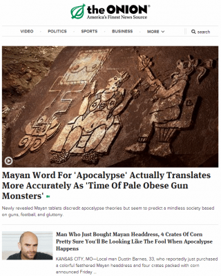
While many long-established newspaper brands struggle with the 21st century, the fake news organization “The Onion” recently gave their website a responsive news site design that really hits it out of the park. It’s modern, fresh, and looks like it could actually deliver real news.
 So why have other actual news websites struggled so much with how to deal with modern times? Well, a lack of resources dedicated to preparing for the future led to too few employees able to answer the many questions that needed solutions. Do you design two websites – one for desktops, and then one for mobile phones. But what about tablets? Do you create an app? But where do you find the resources to create an application for both the Android and Apple ecosystems. And what about RIM? If Blackberry 10 turns out to save the company, that’s just a third app they’ll need to be creating.
If only there was an easy solution to this problem. Oh, wait, there is: responsive designs! These new types of websites have only been around for the past couple of years, but they’re a remarkably simple solution for what was quickly becoming a pretty comprehensive problem. A responsive design adjust elements of a webpage – from image size, to font size, to having entire paragraphs of text and sections of the website disappear, as the website width changes. They allow webpages to display cleanly on desktops, tablets, mobile phones, and every size screen possible.
 But newspapers, notorious for moving slowly, have yet to embrace the change. The New York Times and the Chicago Tribune, for instance, both are yet to include responsive designs. Yes, they have mobile websites. But those look awkward at best on tablets. In addition, Nola.com, The Times-Picayune’s substitute website that is supposed to make up for the four days a week that they no longer print a paper for their hometown, is non-responsive (and has often raised the ire of numerous web-design critics, but that’s besides the point.) These websites, when viewed on different sized screens, bring to mind the geocities sites of the 1990’s. And the one word you never want to hear when someone is talking about your website’s design is “geocities.” Or “fixed-width,” for that matter. But we digress.
The Onion, on the other hand, has embraced the digital age with a fully responsive website. For those who rely on The Onion to help them see the bright side of what’s going on in the world, this feature is quite the relief. The old design was static, with images stuck in a size that is way too large, with text that would stay way too small, particularly on cell phones. Their website new website, though, still features the usual images, videos, and text that it always has. But the new, stylish, minimalist design looks like what a modern newspaper website should look like! We can only imagine how many more people will be fooled by the Onion, now that it’s website looks better than 95% of newspaper’s websites that exist online.
